
Apple green color: a combination of black and light green, olive, pistachio, emerald green, green – contrasting
My house is my castle. Englishman Edward Kok’s commentary on the set of British legislation has become over time a catch phrase, reflecting the dream of every person about an inviolable and safe home. A cozy interior and a well-chosen color scheme can bring it closer.
In this case, the green color deserves special attention. It is as comfortable as possible for perception, personifying closeness to nature and the joy of life. Green symbolizes prosperity, harmony and movement forward. It helps you deal with anxious thoughts faster.
Green color of the kitchen
The green palette includes shades such as emerald, pistachio, turquoise, olive, chartreuse, light green, aquamarine . In each of them, blue and yellow are present in different proportions, adjacent to green in the color wheel. The dominance of the former will bring cool and fresh notes into the interior, the predominance of yellow, on the contrary, will make it warmer. Choosing the right shade allows you to create an atmosphere in the room that perfectly matches the character and preferences of its owner.
In addition to the main shades, there are many others: asparagus, Persian green, forest greens, pear, lime.
Apple and beige beautiful and light combination
With a large area in the decoration of facades, it is worth using several shades. This will make the interior more airy, especially if a dark shade is chosen as the main color in the interior.
When creating a design for a small kitchen, light shades should dominate, for example, a combination of white and light green. This contributes to the visual expansion of the space.
Green can be present both on facades and on an apron or countertop. Lights, overhead panels, flooring, or tiles on the walls can be green.
Advantages and disadvantages
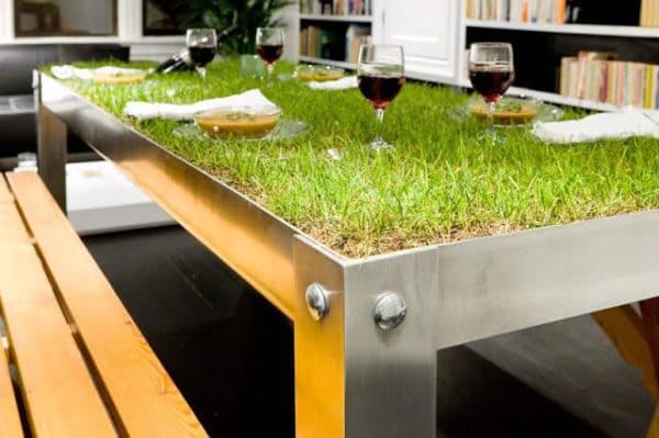
Here is an interesting table in this style. But it’s also green
- With all the richness of nuances, the main thing is invariably. A green kitchen for the inhabitants of the house is not only a functional room, but also a place for relaxation and quick recuperation;
- such a combination of color in the interior of the kitchen has a psychotherapeutic effect, extinguishing aggression and violent emotional outbursts, in contrast to, say, red facades;
- whatever the weather reigned outside the window, eternal summer will reign in your kitchen.
- Cooking and cleaning in such a kitchen is comfortable and pleasant;
- even after a long stay here, the hostess does not feel tired. Natural natural shades are a constant source of energy for her;
Green color not only improves the psychological state and helps with insomnia, but also has a positive effect on the state of the whole organism. Vision improves, metabolism stabilizes, the state of the cardiovascular, respiratory and nervous systems. There is a positive trend in patients with diabetes mellitus.

Negativeness in the perception of green can arise only with individual intolerance to this color or the wrong choice of lighting and shade. The latter also affects appetite. For those who dream of losing weight, it is wiser to choose cold shades: turquoise, emerald, mint.
The presence of a small child in the family dictates different rules. Preference will have to be given to olive, marsh, salad. In this case, the chances of feeding the fastidious increase, especially if decorative elements of orange color will also loom before his eyes.
Correct combination of one scale
With the right combination of shades of green, the kitchen will turn out to be as peaceful and positive as possible. It is enough to dilute the standard color with light green, restrained pistachio, noble emerald or juicy lime – and you will not want to leave this kitchen.
Even a small splash of green will enliven the pale interior of the kitchen.
If the interior uses juicy shades of green apple, fresh grass, or lime, the inclusion of a bottle or emerald can become spectacular accents.
The combination of emerald and white looks spectacular
It is very easy to create a creative and sophisticated interior using green in a variety of color combinations, especially in the zoning of the kitchen and room. The right option for a cozy kitchen is not only a combination of different shades of green but also colors located in the palette next to the main tone and contrasting with it.
Several layout principles are used:
- Similarly;
- contrasting accentuation in tone;
- accentuation of the main color with a shade located on the opposite side of the color wheel;
- selection of colors according to the “cold-warm” scheme.
Variants
Purple or red will be a harmonious complement to green. If you carry out the selection according to the principle of warm-cold gamut for green related to cold shades, orange, yellow and terracotta will become excellent companions.
The following colors are included in win-win combinations along with green :

- Brown;
- achromatic white, black and gray;
- coffee with milk and beige;
- related yellow, blue, turquoise;
- an interesting option can be a combination with olive blue or standard green.
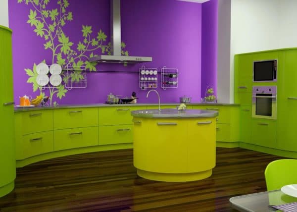
Contrasting combinations
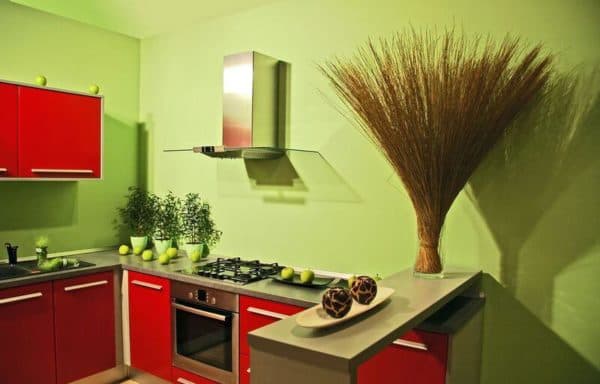
Red is most often chosen as the main antipode to green. The perfectly light green color goes well with pink, purple, and orange with aqua. There are many options for using these colors together. Contrasting accents can be present in textiles, facade elements, and finishes.
Soft green and unusual red? But how spectacular
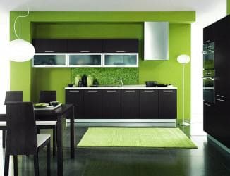
A striking combination of green and black combined with accents of red or gold will create a stylish and highly dynamic interior.
Green and black – stylish and modern. This combination looks especially good with simple Japanese-style furniture.
Contrasting combinations for light green, light green, and dark green

The contrast of light and dark green looks very fresh
Light green, light green, and pistachio, chosen as the main background, look most advantageous against the background of pink, purple-red, sakura, and peonies, creating the atmosphere of a blooming garden.

Pink and orange with green will make the room bright in summer
For example, for the dominant light green, you should choose curtains in warm shades – pink, pastel, or yellow. The apron and tabletop in this case can be orange, gray, beige, cream, or brown. Gold or beige curtains will add sophistication to the interior.

green with yellow is the most common combination, but here you need to maintain a balance
If the main color is emerald, it is reasonable to pair it with white.
Perfect companions of light green are neutral black and white, milky, light gray, creamy. Yellow and orange decorative elements will become a highlight in this interior.
Dark green, chosen for an English-style kitchen, may seem somewhat gloomy. However, adding contrasting burgundy, milky, cognate contrasting brown, brass or silver to it, you can get a completely luxurious interior. Plastic chairs and a glass table will help to make the interior less solid if necessary.
How to place accents correctly
When planning to use different shades that complement the main tone, you should remember the following rule: for the main color, set aside 60%, for a secondary, but significant shade – 30%. We leave only 10% to the share of accents .

The main thing is to correctly combine balance and correctly enter accents.
When choosing accents, it is very important to strike the right balance, not forgetting good taste. They should delicately shade and complement the dominant color without hammering it, for example, colored chair covers.
In a kitchen with a predominance of pistachio shades, decorative details and accessories in a deep blue sea color look interesting . Dosed use of yellow is appropriate with light green and turquoise . Delicate shades of blue are harmonious in combination with the color of green apple.
Orange decorative elements stimulate appetite well.

Bright orange will make the kitchen look more sunny.
One of the main accents can be an apron of the work area or a tabletop. Pillows and upholstery of a kitchen sofa, covers in a contrasting color, napkins look spectacular.
Light
Correctly selected light in the kitchen will emphasize the color of the walls, but you need to choose the right one
One of the most important elements of creating the right interior is proper lighting. When choosing lamps for a green kitchen, you should give preference to warm shades of yellow. This will make the room even more comfortable . Use wall lights.
Are the kitchen windows facing north? Warm shades, such as yellow-green, should prevail in facades and finishes. On a sunny day, a colder scale looks more advantageous.
Insufficient lighting, lack of accent lamps fashionable now can “ruin” some colors. For example, mint or pistachio.
Styles
The versatility of green allows you to choose this color for any style. Provence, hi-tech, country, casual, classic.
- Dark green facades are a great option for English, ethnic or eco-style ;

Ethnic style and greenwood furnishings look luxurious
- Olive, pistachio and mint are harmonious in the interior of almost any style, including classics, shabby chic, Provence and country;

Provence goes well with olive tones
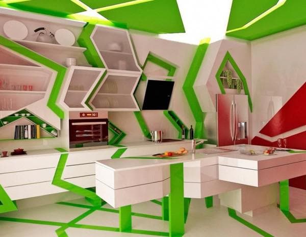
- Acid shades are an adequate choice for high-tech style .
Bright combinations are perfect for modern styles
- Light green and pale green will accentuate a kitchen set made of wood for a classic kitchen design.

Classic and light green – a harmonious combination
Who is the green kitchen for?
The relaxing and pacifying effect of green cuisine is beneficial for everyone. And sanguine people, and choleric people, and phlegmatic people, and melancholic people will feel great in her. However, for phlegmatic people, contrasting accents will not be superfluous, which will not allow you to relax excessively in such an interior; the summer table setting will harmoniously fit here.
Cold shades soothe, while warm ones activate.
Energetic people who want to do a lot should prefer bright shades, glossy surfaces of facades. After all, green is able not only to soothe but also to stimulate vital energy and raise the tone. It is worth remembering, however, that a very intense and vibrant shade can become tiring on the eyes over time.
Our photo selection will help you decide on your green color scheme:
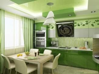
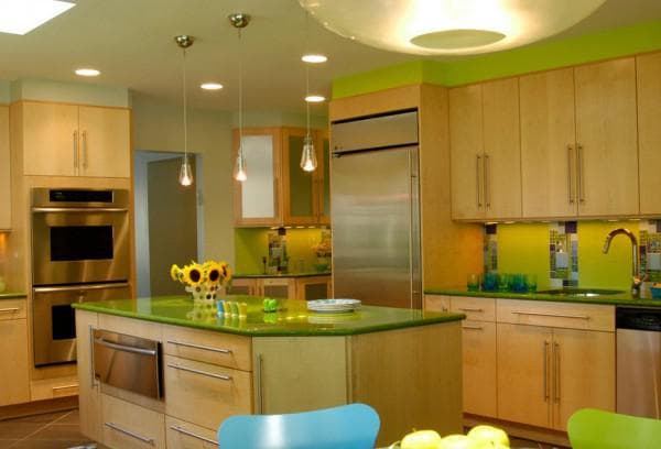
See how to combine three colors from the green palette

White looks spectacular with any tone of the green palette

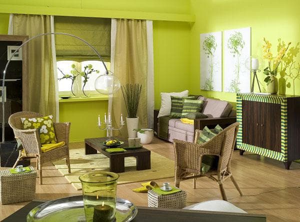
Floral print will make the interior more playful

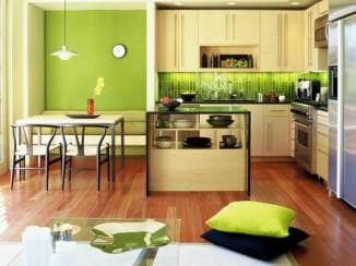
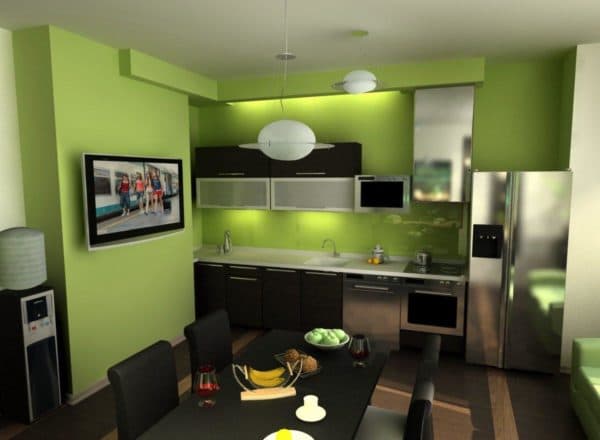
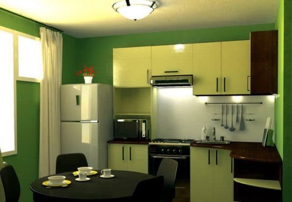
It should be noted that the green palette goes well with both light and dark furniture.
Light green inserts will make the kitchen futuristic
Japanese style also goes well with green colors.

Blue shades must be entered carefully.

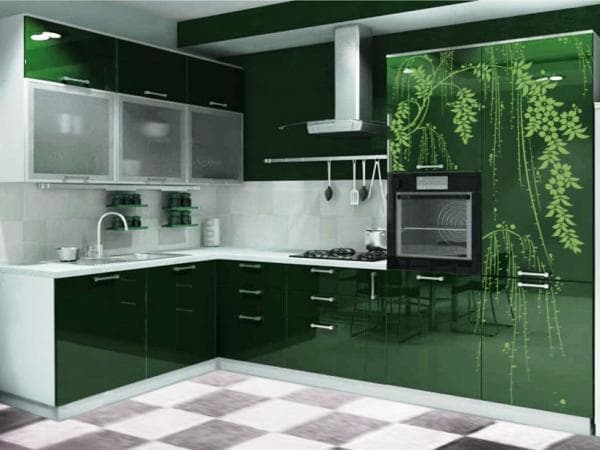
Even a very dark kitchen looks luxurious in green tones.

Mint shades will make the kitchen fresh
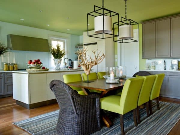
See how beautifully the wicker kitchen is combined with green walls
Do not be afraid of green in the interior of the kitchen. It will help create a real home in the house, warm and cozy, which will become a place of attraction for all family members.